Read time: 1.5 minutes
Using Arial for your headlines is like wearing Crocs to a cocktail party.
It shows you can’t dress yourself properly.
Unfortunately, many people stick to Arial or Calibri for everything.
It’s not wrong… just limiting.
Your font choice shows your personality.
It sets the mood for your content.
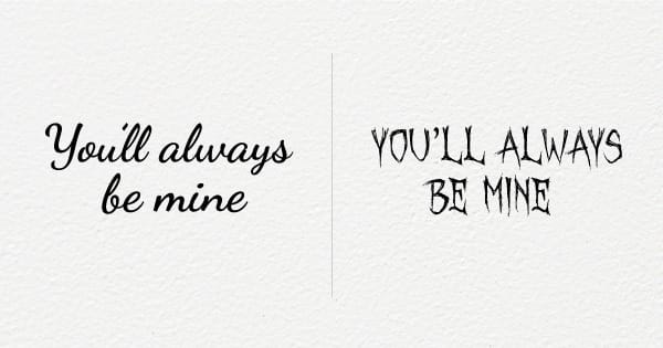
It can even change the meaning of your words entirely:

Now imagine...
...walking into that same cocktail party with nice clothes and a pair of dress shoes.
Would the people have a better impression of you?
Just like your attire, your typography is a vital part of your visual identity.
Choosing a font is a great opportunity to influence how people see you.
Pop Quiz
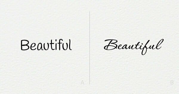
1. A or B – which one is friendlier?

2. A or B – which one is stronger?

3. A or B – which one is more elegant?

B is the correct answer for all three.
If you said A for any, I’m sorry… you’ll have to sit the next round out.
jk
Seriously, though…
How does your typography look?
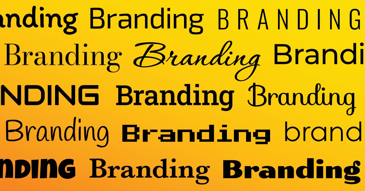
Use this easy guide to choose a great headline font 👇

Need help making a choice?
Hit reply and give me 2-3 Adjectives for how you want people to see you. How do you want them to describe you to their friends?
I'll get back to you with a pair of fonts you can use.
See you next Tuesday,🤖 Robert
P.S. For body text, I usually choose from Lato, Roboto, and Open Sans — which are all Google fonts.
Did you like this content?
💃🕺 Would you share it with ONE friend? It means a lot.
🐦 Catch me on Twitter @RobertHacala for more branding tips.


