Read time: 2 minutes
We interrupt this programming to bring you a delicious message:
🚀 I’ve launched my first offer! Yay!
It’s a high-impact design review to boost your landing pages and campaign performance. This includes a detailed report and a 10-15 minute video with actionable steps to improve consistency, legibility, and conversions.
Perfect for Black Friday!
If you or someone you know is preparing for the holiday rush and want a fresh design perspective, check out Art Direction by the Slice 🍕 (limited to 10 spots).
And now back to our regularly scheduled programming:
Easy Guide to a High-Converting Page
Ah yes, the ol’ landing page…
It’s not just an entryway to your business. It’s your chance to make an excellent first impression!
To hook visitors, every detail needs to be seamless, inviting, and intentional.
Let’s create a landing page that makes people stick around and click.
Crafting a Landing Page that Clicks
Here are 5 essential elements for a landing page that’s built to convert:
1. Value Proposition
Give your visitors the good stuff upfront. Highlight the main benefits in a way that’s easy to digest. Show them exactly what they’ll get and why it matters. Answer that essential question, “What’s in it for me?”
2. Hero Section
Make an unforgettable first impression by grabbing attention immediately. Use a bold headline and clear subhead to set the tone. Pair this with visuals that match your message and audience. Let visitors know why they should stay within seconds.
3. Social Proof
People want reassurance that they’re not alone in choosing you. Build trust by adding testimonials, client logos, media logos, or compelling stats. Each piece of social proof signals reliability, showing new customers that others have benefited from what you offer.
4. Call to Action (CTA)
The CTA is where it all comes together! Make it bold, clear, and actionable so it stands out on the page. Position it strategically to guide visitors effortlessly toward that next step — whether it’s signing up, purchasing, or learning more.
5. Smooth Layout and Visual Flow
Use layout, design, and imagery to create a natural flow from one section to the next, leading the reader’s eye directly to your CTA. Less clutter = more conversions.
Examples of Excellent Landing Pages
Below are the hero sections of three different pages — one solopreneur and two SaaS companies:
Kieran Drew – Solopreneur
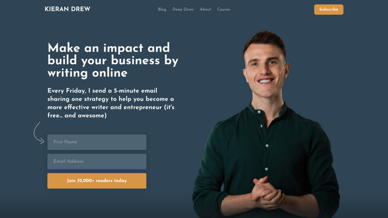
Kieran Drew’s home page
Clear value proposition and benefits in the heading and intro
Arrow pointing to the form helps guide the eye
Simple colour set: a calm muted blue and bright gold accent
Excellent photo — posture and expression
Social proof in the button copy: “Join 32,000+ readers today”
Lots of white space and clear hierarchy
Minimal navigation at the top to keep it uncluttered
Beehiiv – Email Marketing Service
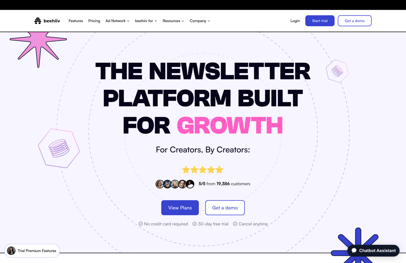
Beehiiv’s home page
Visually interesting with the colours and animations
Huge headline with a highlighted benefit “Growth”
Identifies the audience and founders in one shot: “For Creators, By Creators”
Prominent social proof with profile pictures and impressive numbers
Clear button difference: one filled, one outlined
Objection handling directly under buttons: “No Credit Card Required”, etc.
Includes a Chatbot Assistant to get answers quickly
Wistia - Video Marketing Platform
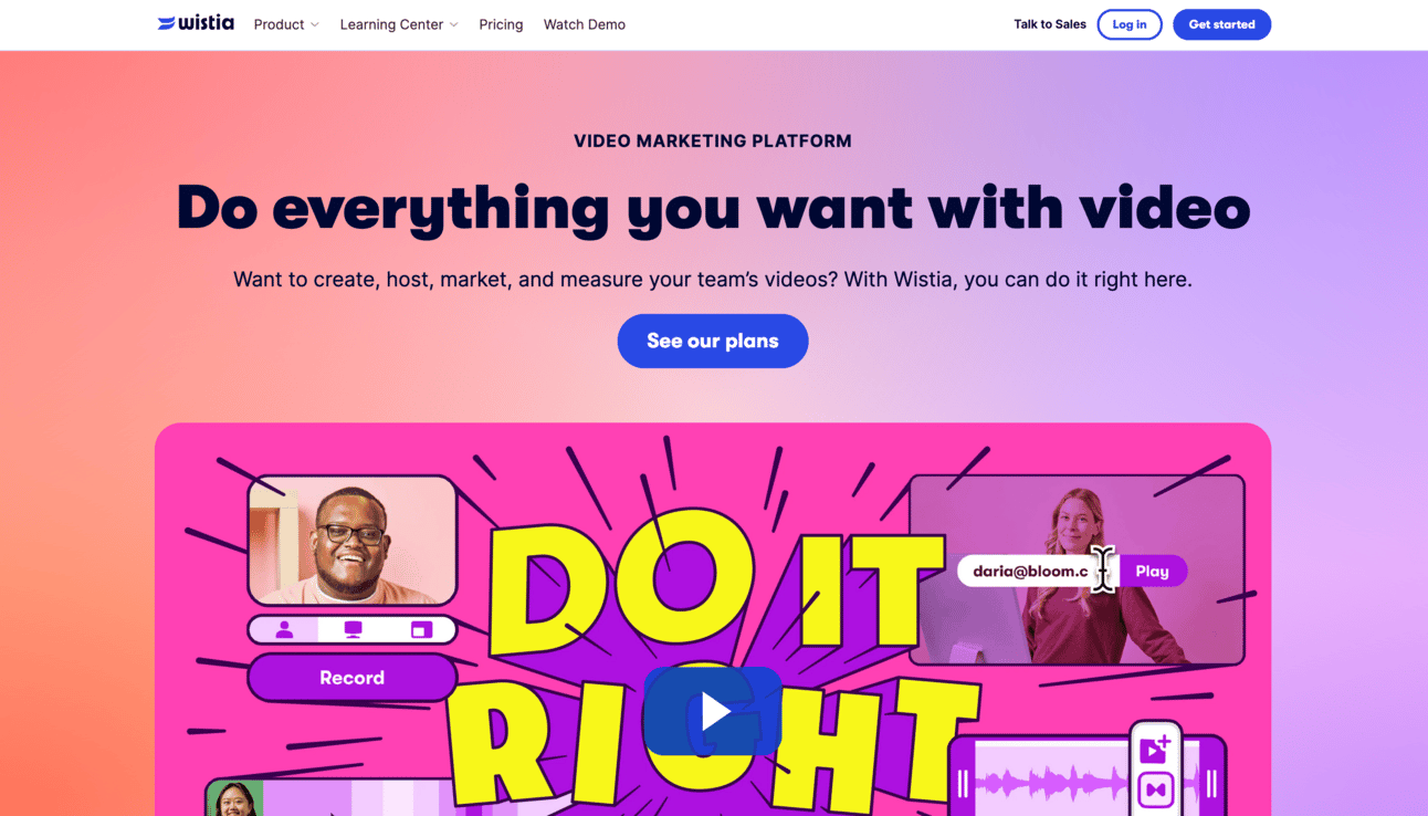
Wistia’s home page
Bright, playful colours to match their audience and brand personality
Big heading with a plain description above it: “Video Marketing Platform”
Clear value proposition in the subheading
The button is prominent, near the top, and has clear copy: “See our plans”
The big video thumbnail creates lots of interest and curiosity
Upon playing, the video is visually exciting and has a great soundtrack
A well-crafted landing page makes each section work in harmony to deliver one clear message: “Here’s what we’ve got, here’s why you need it, now let’s make it happen!”
Got a question about your landing page? I’m all ears.
🟠 Robert
P.S. So if you know someone doing a Black Friday or Holiday sale, go ahead and point them to Art Direction by the Slice 🍕 for an expert design review. Thank you, thank you!
Share this newsletter… may your coffee be smooth and your pizza be cheesy!

