Read time: 3 minutes
Imagine…
You have a kick-ass website.
It’s got some nice imagery and clear copy.
Visitors get interested and decide to reach out to you.
They navigate to your contact page…
…and it all falls apart.
You’ve just lost this lead due to a confusing or hard-to-read contact form.
Judging by some of the forms I’ve seen in my day, I’d say it happens all the time.
Shame, really…
It doesn’t take much to have a legible and inviting form.
First, I’m going to ROAST five bad forms I found…
Then I’ll follow up with some nice ones…
Some of the Worst Forms I’ve Seen 😱
Buckle-up, Buttercup…
It’s time to rip on some atrocious design choices…
To kick this off, we have…
1. The My-Eyes-Are-Going-to-Explode Form
This layout makes me tired just looking at it — my eyes jump around and don’t know where to land.
Too much contrast — bright white text on a pitch black background strains the eyes.
In the label text, the letters are too spaced out, which makes them harder to read.
A solid colour submit button would be more noticeable than this outline button.
Two-column layouts aren’t great, especially when the whole form is two columns.
7 of these 8 fields are required 😳 — and required fields suck!

You may also notice the bad grammar in the heading.
Which brings us to…
2. The Brain-Don’t-Know-What-To-Do Form
This form may not seem so bad at first, but I’m willing to bet a simple A/B test would say otherwise.
Too much space between the fields and their related labels. (Things that are related should be placed closer together.)
Again with two columns… it can be good for saving space, but reducing the space between the fields can help with that too.
The placeholder text (inside the text fields) is all redundant questions, which makes the brain work more. (Why ask “What is the name of your company?” right under the label that says
“Company/Organization”?!)

Of course, we have this one…
3. The Too-Busy-Low-Contrast Form
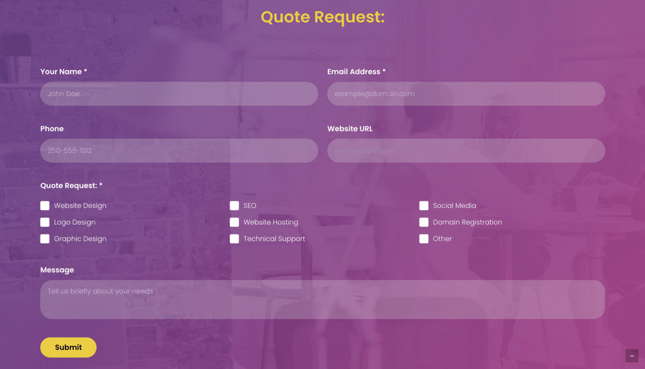
This is a quote request page from a web designer… but there’s no chance in hell I’d hire them.
Low colour contrast between the fields, the placeholder text (inside the fields), and the background.
The background image makes the page seem busier and doesn’t add any value or emotion.

Do you think the yellow–orange colour goes well with these purple tones? I think you can probably guess how I feel about it just by this question 😜
Here we have…
4. The When-Is-It-Going-To-End Form
People love asking too much of their visitors 😕
Plus there’s a bunch of other bad design choices from this IT Solutions company…
No need for my address or phone number (we haven’t even been on our first date yet).
The text labels are centered down the left side, while the fields are inconsistent sizes and centered on the right side — making this whole thing feel very unfamiliar (unfamiliar = untrustworthy).
The checkboxes don’t fit on one line, leaving “Consultation” lost on its own.
Using the label “Comments” instead of “Message” makes this unfamiliar and impersonal.

“How can we help you?!”… more like, “How can we make this more painful for you?”
And then there’s this gem...
5. The Please-Just-Make-It-Go-Away Form
I don’t care how many awards this web design agency has… I certainly won’t be asking them for a quote.
The page is way too busy overall.
Not only is this a two-column form, but the form sits on a two-column page layout 😆
The award icons are the main focal point (when the headline and submit button should be).
Placing more links only takes visitors AWAY from this page, which defeats the whole purpose.
Too many required fields — I shouldn’t have to tell you where I found you or what my budget is.
Low contrast and tiny font sizes alienate like half of the population.
There are instructions for us in that right-side paragraph: “For brand identity and other non-web projects, please email us directly for more information.” (In other words, “DON’T USE THE FORM THAT’S RIGHT BELOW THIS TEXT!”)

How many times can you say the same thing?! “Let’s talk”… “Start a conversation”… “start with hello”… drop us a line”…
Whew… I’m glad that’s over…
Now onto the GOOD stuff.
Just like a web layout, it’s important to make forms look familiar — and it’s totally fine if that makes them look bland and boring.
They’re not meant to win awards; they’re meant to convert.
You can always use your brand colours or improve your design in other ways…
But this is NOT the place to get TOO FANCY with custom fonts, tiny text, and busy backgrounds.
Great contact forms have:
Familiar layout
Legible typography
Enough contrast
Clear headlines, labels, and placeholder text
Appropriate spacing between elements on the page
Easy-to-see submit button
Single-column layouts (usually)
As few fields as possible (usually)
As promised, I’ll leave you with some forms that do the job well…
Well-Designed Contact Forms 😎
A standard-looking design where everything is clear:

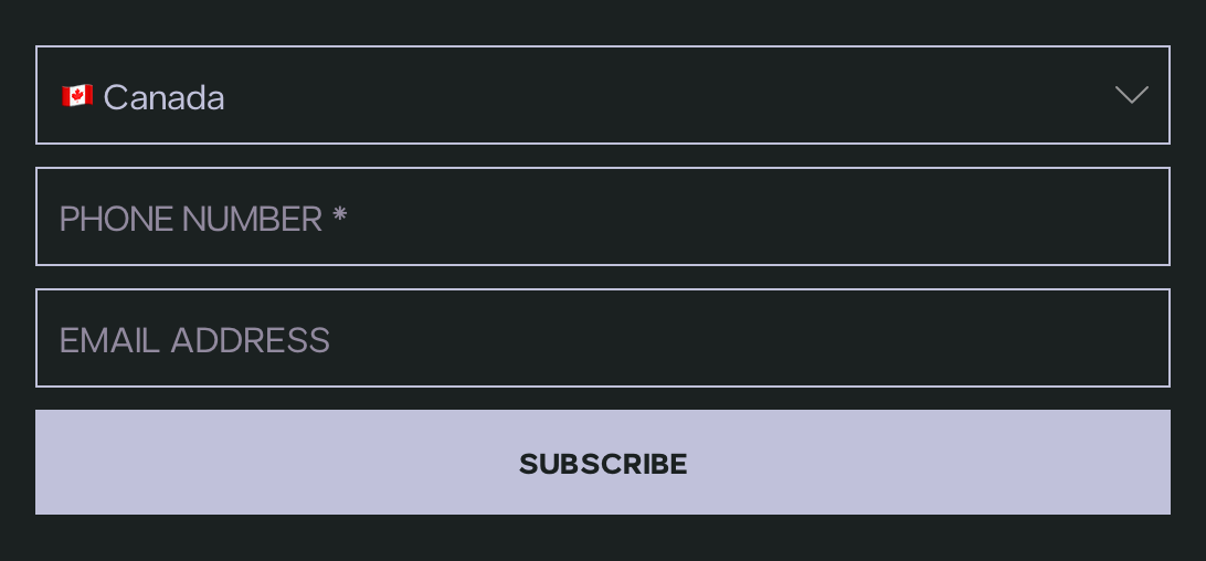
A simple contact form for SMS marketing:

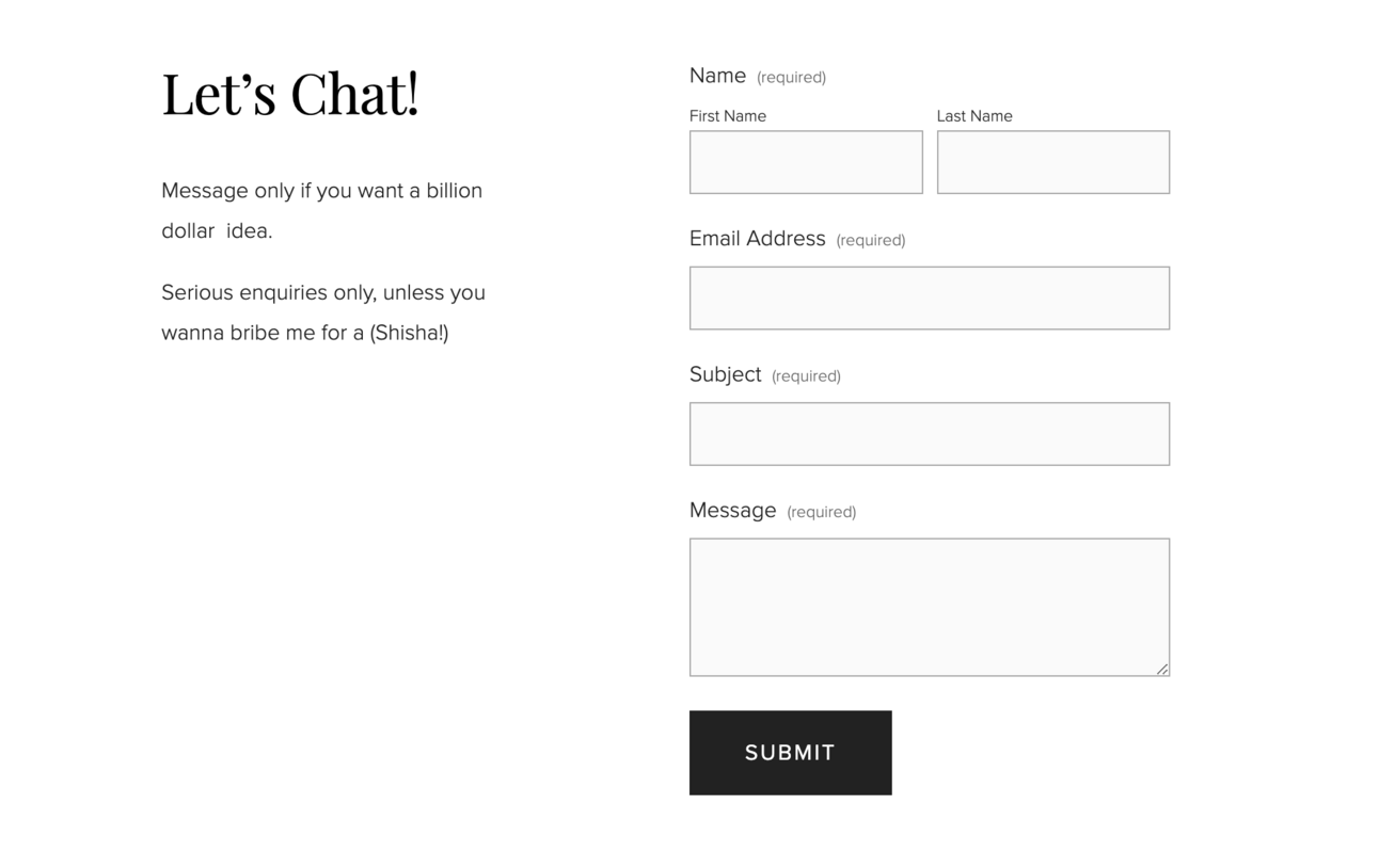
Nice page layout with ample white space and a familiar-looking form:

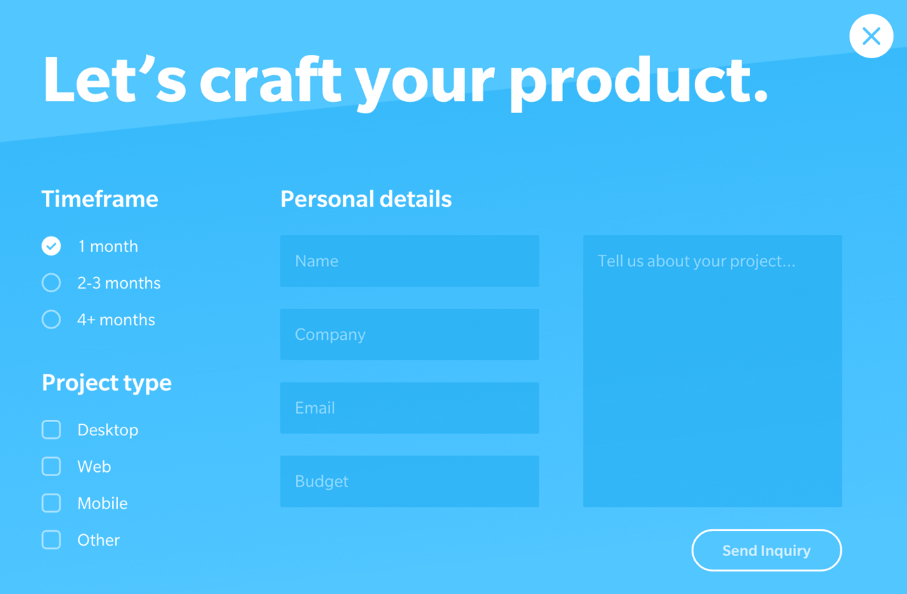
A simple form, relevant illustration, and snazzy gradient button that stands out pretty well:

Although the text contrast is a bit low here, this form has great layout, colour, and headings.

Nothing fancy here, just branded colours and lots of contrast:

Remember…
“When it comes to websites, the form IS the function.”
– Laozi

Laozi sure knows a thing or two about digital marketing
Was this Interesting? Useful? Silly?
Let me know what you think.
🤖 Robert
🧡 Share this newsletter… and we’ll ignore that collection of ugly sweaters hanging in your closet.


