Read time: 1.5 minutes
Want an easy way to improve your website for your visitors?
Avoid using pure black (#000000) for your text and backgrounds.
Black can strain the eyes when used in large amounts, like backgrounds and long text blocks.
Now, you may be thinking…
“But it’s the standard choice and everyone uses it… whatever will I do?!”
Don't worry… there's a better option.
Take a look at the comparisons below:
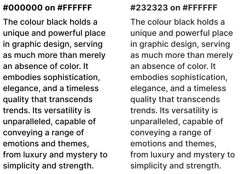
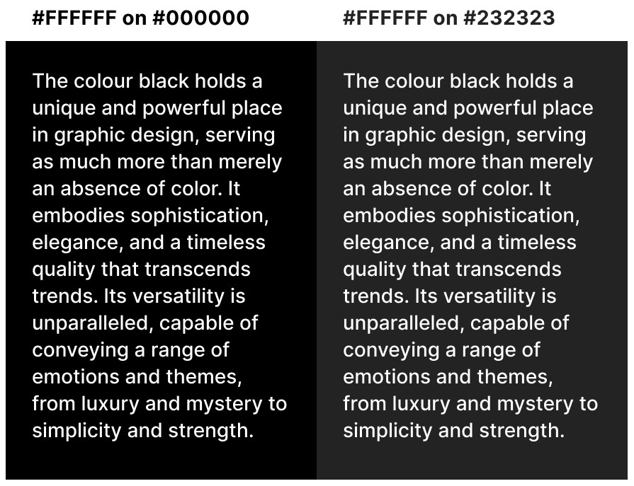
See the difference?
It's subtle but significant.
Many reputable websites opt for dark greys for their body text:
Medium uses #242424.

The New York Times uses #363636.

Reuters uses #404040 (though some people find this too light for text).

I usually go for #222222 or #232323 — a nice sweet spot and easy numbers to remember.
Choosing an off-black makes the text less jarring… a bit softer… and more comfortable for the eyes.
So your visitors and readers will tend to stick around longer.
Why Stop At Greys?
The greys I’ve shown so far can still look pretty dull…
For more interest, consider a hint of blue.
Dark blue-greys offer a less flat appearance compared to neutral greys.
Some prominent brands have already embraced these calming hues…
Wikipedia uses #202122.

𝕏 uses #0F1419.

Entrepreneur.com uses #374151.

What About Backgrounds?
If you're working with a dark theme, try experimenting with slightly coloured dark backgrounds for a more sophisticated look.
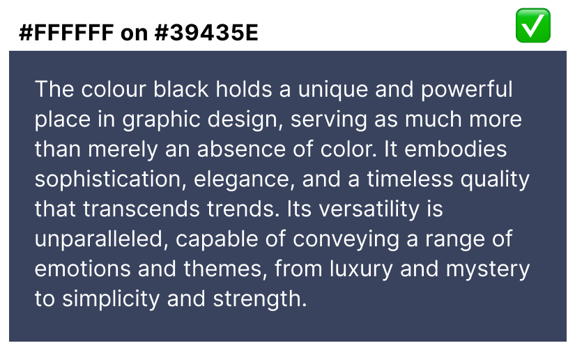
That’s one snazzy lookin’ blue-grey ^
For light themes, explore the light yellows and beiges for a nice welcoming feel.
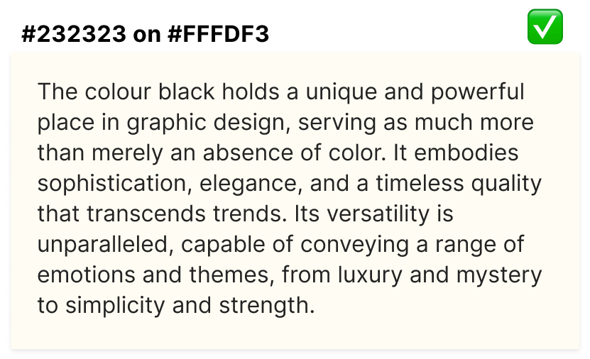
So nice, don’t ya think?
Quick reminder:
Maintain a good contrast and avoid overly saturated colours…
We're not trying to recreate the early ’90s web!
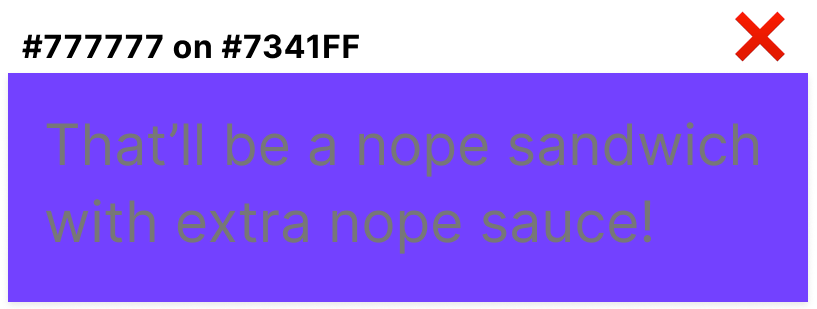
My eyeballs want to gouge their eyeballs out!
In the End
Choosing a dark grey over pure black can greatly enhance readability and comfort for your website visitors or app users.
If you need help selecting colours that suit your audience, just yell.
We can make your website more visually appealing together!
🤖 Robert
Share this newsletter and I’ll stand on my head for 3 hours

