Read time: 2.5 minutes
Everyone talks about consistency.
Nobody talks about repetition.
So let’s talk about that, shall we?
But first…
A little clarification:
Consistency and repetition are similar…
But they’re not the same —
Consistency means keeping the same style/voice/personality across your whole brand image.
→ Usually found in your fonts, colours, imagery, messaging, etc.
Repetition means a recurrence of specific things within your design.
→ Usually your headshot, tagline, shapes, angles, backgrounds, etc.
Here’s an analogy:
Consistency is the underlying melody and rhythm that runs throughout a song and sets the mood.
Repetition is the recurring chorus that makes the song catchy and memorable.
Both are important concepts in branding.
Together, they help you…
Be more interesting and memorable.
Establish and reinforce your brand identity.
Create a sense of trust and familiarity with your audience.
Now it’s time to get practical…
How Can You Use Repetition in Your Branding?
Say you’ve already chosen a brand colour, a couple fonts, some images, and a message…
And you’re using them consistently.
(You ARE using them consistently, right?)
Just try REPEATING certain things within your designs:
A background, pattern, shape, angle, or button style…
Even your name or your sign-off.
Examples:
I always use the robot in my name (🤖 Robert), and now in my DMs, a few people have addressed me as just 🤖
Over the years, I’ve seen a few different people use “onwards and upwards” as a sign-off.
Repetition even extends into video and audio branding.
It’s essential to have the same intro or soundtrack in your videos and podcast episodes.
That’s your theme!
Alright, alright, alright…
Let’s look at some great examples of repetition in brand design…
Examples of Repetition in the Wild
Like many big consumer brands, Target repeats its iconic logo across multiple campaigns and media.
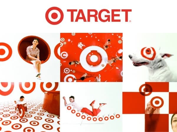
How can you steal this? → Use the same logo, background, and shapes throughout your social profiles, web pages, and digital products.
You may not have the same budget or design team as Target…
But there are lots of other ways to add repetition to your design…
Solopreneurs Using Repetition
One easy way to do this is to use the same object in various places.
See how Dylan Redekop uses the lightning bolt multiple times in his profile:
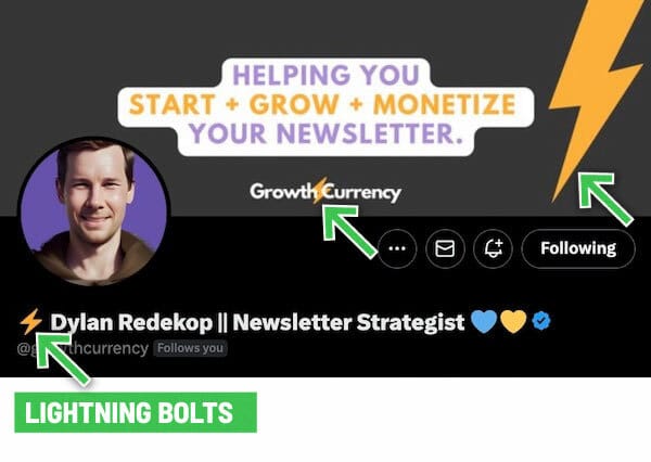
Try using the same shape for your containers, backgrounds, and buttons.
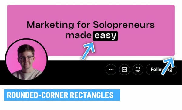
Dan Kulkov uses the same rounded-corner rectangle twice in his banner:
And that brings us to…
An excellent example I came across the other day from Jens Lennartsson — and his Make & Market newsletter for SaaS founders.
Jens has a few things echoing nicely in his brand design:
The card shapes
The black speech bubble labels
The dotted background texture (in two different colours)
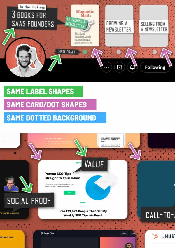
👇 Take a peek below…
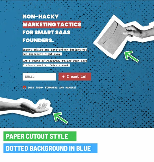
Notice how Jens’s Newsletter subscribe page is a completely different colour than on Twitter?
The grungy dotted pattern is so recognizable that it’s safe to use a different colour for the newsletter.
Both the red and blue backgrounds still look like they’re from the same person/brand.
And on this subscribe page, a new repetitive element is introduced — the black and white paper cutout style:
So tell me…
Are you using any recurring elements in your design?
🤖 Robert
ANSWER TO LAST WEEK’S RIDDLE
I always run but never walk. I often murmur but never talk. And I have a bed but don’t sleep, and I have a mouth but never eat. What am I?
→ A river.
TODAY’S RIDDLE
What belongs to you, but other people use it more than you?
——
If you think you know the answer, hit reply and let me know… or find out in next Tuesday’s newsletter.
🤔 Like my content? Share this newsletter with a friend. Noice!
🐦 Catch me on Twitter @RobertHacala for branding tips and bad puns.

