Read time: 2 minutes
Shape clay into a vessel;
It is the space within that makes it useful.
Cut doors and windows for a room;
It is the holes that make it useful.
Therefore, benefit comes from what is there;
Usefulness from what is not there.
— Laozi (老子)
This is from Chapter 11 of the Tao Te Ching (道德經).
It’s an ancient book of profound wisdom, and the origin of Taoist thought.
When I first read this verse, it stood out to me, and I never forgot it.
Later, in my Graphic Design course…
I realized this ancient wisdom also applies to design.
Curious how?
Keep reading…
The Usefulness of Space in Design
Great use of negative space (white space) keeps your readers around longer.
Your content will be easier to consume, and you’ll be able to guide the eye where you want.
Benefit comes from what is there → words, graphics, buttons, images
Usefulness from what is not → negative space between those elements
Cluttered design lacks hierarchy, balance, contrast, and a clear focal point.
This confuses viewers, and their eyes get tired from jumping around too much.
And this ancient concept can be applied to any kind of design: presentations, ads, newsletters, book covers, print materials — even interior design and architecture.
Here are some tried and true tactics for using white space…
How to Use White Space Effectively
→ Increase Legibility
Add enough spacing between the lines and paragraphs of your text.
Giving it this breathing room is way easier on the eyes, especially when there is lots of text.

→ Reduce Heaviness
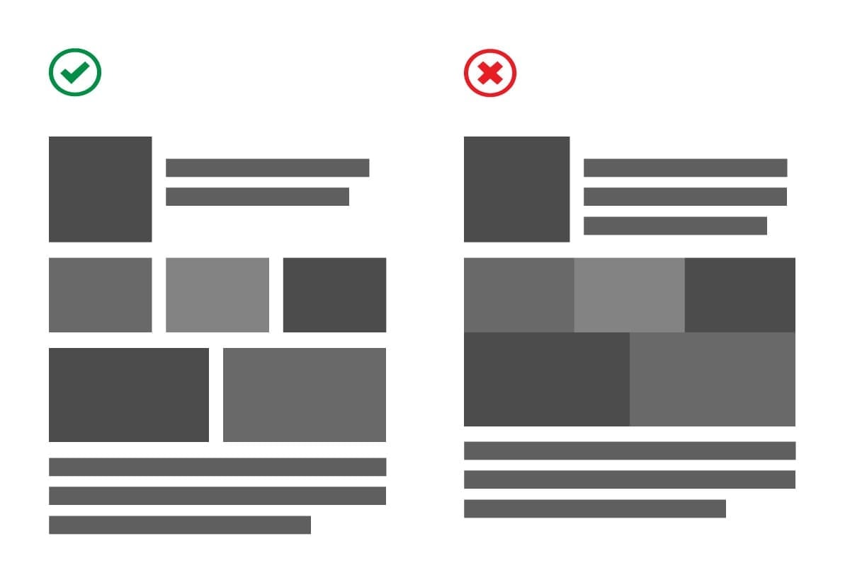
Add space between images and other large elements to make your design feel lighter.
This also lets viewers’ eyes relax more, so they view your content for longer.
→ Bring Attention to an Element
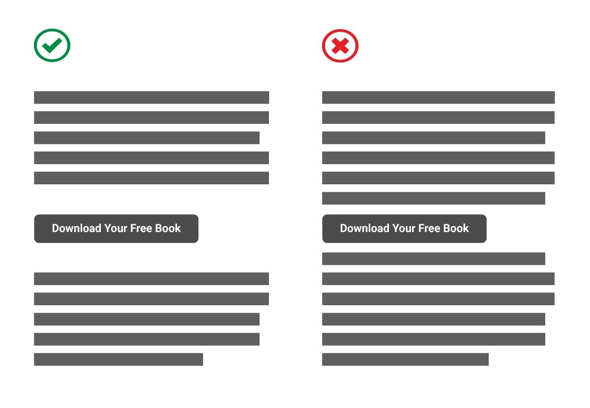
Surround an element (or a small group of elements) with more space so it stands out more.
→ Avoid Confusion
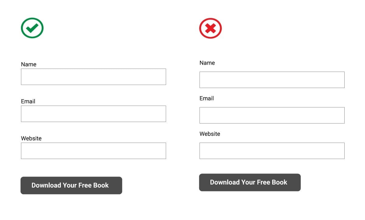
Keep related items grouped together and add space between the groups.
This helps viewers easily understand your design at a glance.
Now let’s look at some excellent examples…
Examples of White Space on Websites
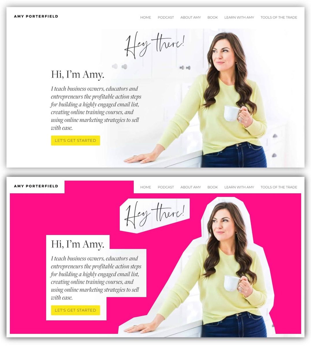
The two examples below are from the homepages of Gary Vaynerchuk and Amy Porterfield.
I've highlighted the white space on each page, so you can easily see how much there is.
→ Gary Vaynerchuk’s Homepage

→ Amy Porterfield’s Homepage
Need help designing pages that keep people around longer?
I’d be happy to give you some more insight.
Contact me here and let’s chat.
🤖 Robert
💃🕺 Would you share this newsletter with a friend? Noice!
🐦 Catch me on Twitter @RobertHacala for brand tips and bad puns.

