Read time: 2.5 minutes
Imagine this:
You're in a bustling city known for its vibrant music scene.
You hear about a concert with an unusual band: Monotone Melodies.
What's different about them?
They all play the electric guitar.
You arrive at the venue — it’s packed.
Anticipation is high…
All five members of the band walk on stage, each with an electric guitar in hand.
A curious murmur sweeps through the crowd.
The music starts, and it’s… well…
Strange.
Monotone Indeed
The five guitars screech, every note competing with the others.
You hear some melody, but the guitar sounds all blend together.
There’s clearly a lack of diversity in the instruments…
No drums to compliment the melodies with rhythm.
No bass to maintain the foundation of the song.
No singer to be the main focus and lead the narrative.
It’s monotonous.
The audience is confused.
You think to yourself…
“Why did I come to see this noise?”
Now Swap this Band for Design
Imagine this:
A website where everything is screaming for attention…
Every element is the same size, same color, same boldness.
There is no clear focus and your eyes get tired of jumping around.
You feel confused and disinterested.
It kinda’ reminds you of Monotone Melodies.
So what would make this website look better (and the band sound better)?
Hierarchy: The Balance of Importance
Hierarchy is the way designers arrange elements to show their importance.
It's like a guide for the viewer's eyes.
Important things are made bigger, bolder, or brighter, so you notice them first.
Less important things are smaller, lighter, or spaced out more.
This helps the viewer understand the message quickly and easily.
Everything appears harmonious and balanced.
Each component has its place and purpose.
Kinda’ like a band.
From Rock Band to Graphic Design
Let’s dig into the analogy a bit more…
→ Lead Singer
The lead singer is your headline — front and center, grabbing the audience’s attention and driving the narrative.
It sets the stage for the rest of the design.
→ Guitarist
The guitarist could be your key visuals — right up next to the headline as secondary focal points.
They add emotion and depth to the design.
→ Bassist
The bassist is your tertiary elements in design.
Bassists don’t often stand out, but they hold the song together and give it a groove.
→ Drummer
The drummer establishes the tempo and rhythm — a consistent backbone to the song.
This is akin to the design’s grid or layout system.
→ Band as a Whole
A great band works together to create a harmonious sound, with each member playing their role.
It's the same with great graphic design. Each element works together to make it look and feel right.
The careful mix of elements ensures a design is engaging and communicates a clear message.
Now, let’s look at some examples in the wild:
Examples of Hierarchy in Design
We’re going to look at some celebrity websites.
We’ll start with bad design so we can end on a good note 😉
Here are a couple of designs with terrible hierarchy:
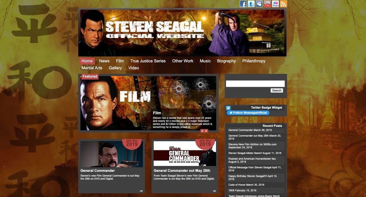
❌ FAIL: Steven Segal
There’s way too much going on here — no way for the eyes to rest.
Only Seven’s name and the word “Film” stand out (a bit)… while everything else is screaming for attention.

My eeeeeeeyes… they’re buuurning… 😫
❌ FAIL: Billy Bob Thornton
Straight outta’ the 90s… we have an interesting one here.
This page has no focal point, but for a different reason that Steven Segal’s site…
All of the elements are floating in air and equally spaced apart!

Make it stop, Bob, make it stop… 😬
And now for some designs with excellent hierarchy:
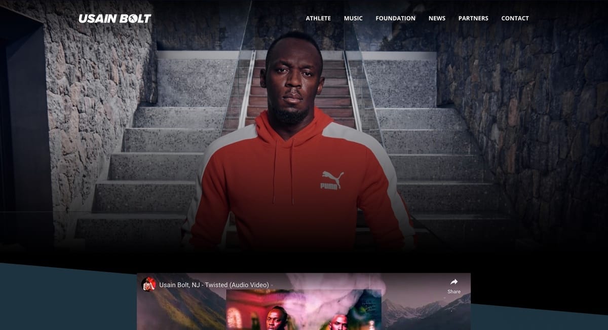
✅ WIN: Usain Bolt
A stunning web page with distinct elements.
Usain’s headshot is nicely framed by the symmetrical background.
Our eyes move from the image, to the logo, to the navigation…
Then to the video peeking out from the bottom (making us want to scroll).

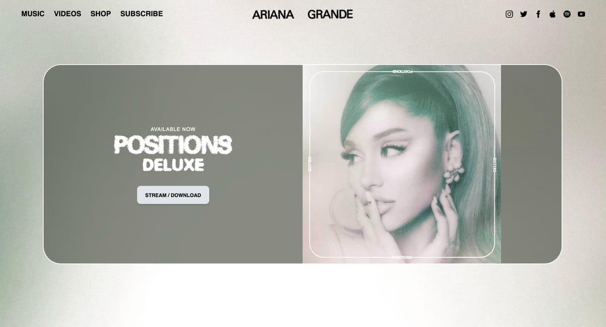
✅ WIN: Ariana Grande
Ariana gives us a page with clear hierarchy.
Our eyes can jump between the distinct sections without getting tired.
And with lots of white space, it’s easy to zero in on the album title CTA button.

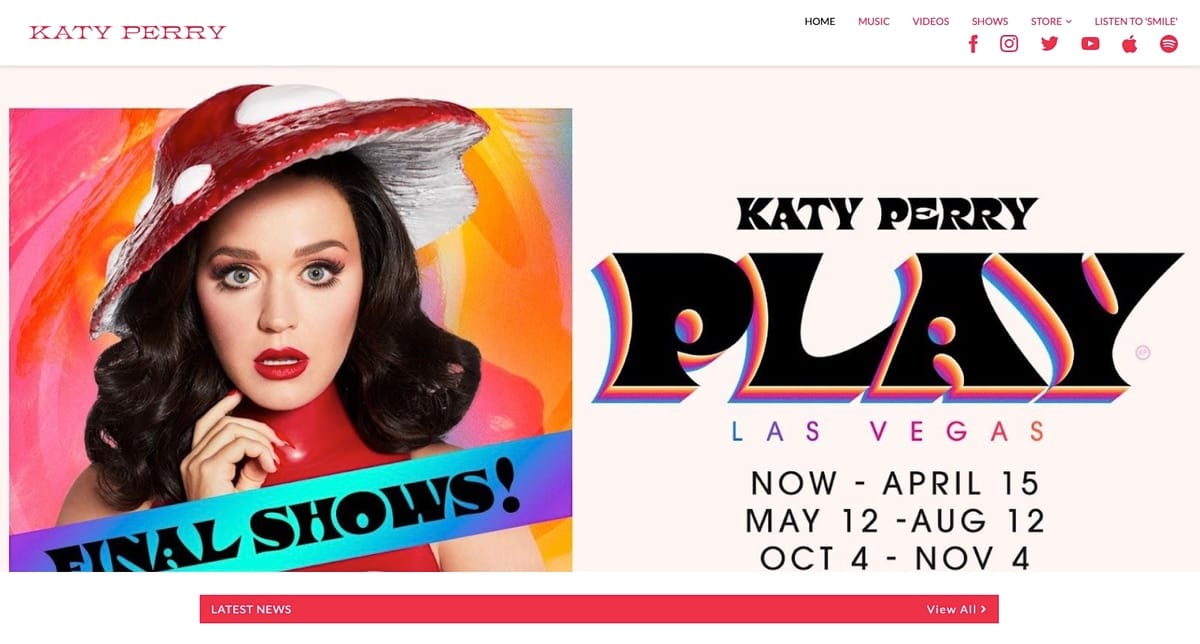
✅ WIN: Katy Perry
I almost didn’t feature this design because it’s a tad busy…
However… the most important elements still grab our attention first:
Katy’s expression, the blue “Final Shows” ribbon, the big “Play” tour name, and the show info underneath.
The rest of the elements stay well out of the way and don’t fight for attention.

Want more design tips?
Catch me on Twitter and show me your design or social profile — I’ll give you my honest feedback.
Or just tell me your favourite band 🎸
(Mine is Tool.)
If you enjoyed today’s issue, then you’ll love this other one I wrote…
Till next week…
Keep rockin’
🤖 Robert
🔸 Share this newsletter with a friend or I’ll sing Baby Shark for 10 hours.
🔸 Get my Free Positioning Worksheet to define your brand in one sentence.
🔸 Follow me on Twitter for brand tips and bad puns.


